Potions for SalE
Plum, a traveling potion merchant with big dreams and meager luck, adventures through a tumultuous world to make the best of his chosen profession. Underlying his quest are the solemn undertones of sacrifice and yearning. What’s one willing to give up in pursuit of a dream? What amount of money, opportunities, and time would you let slip through your fingers to venture off the beaten path?
Potions for Sale is a visual development project that revolves around creating the unique visual identity of a mock video game. It tackles system mechanics and experiential goal considerations through a visual and interactive approach, positing the inherent interconnectedness of the Game Design, Visual Design, and UI/UX disciplines.
Genre: Shopkeeping, RPG
Platform: PC & Mac, single-player
Tools: Photoshop CC, Illustrator CC
Team: Solo.
Duration: August 2017 - December 2017
NYU Game Center's End of the Year Showcase, 2018.
Roles & Contributions
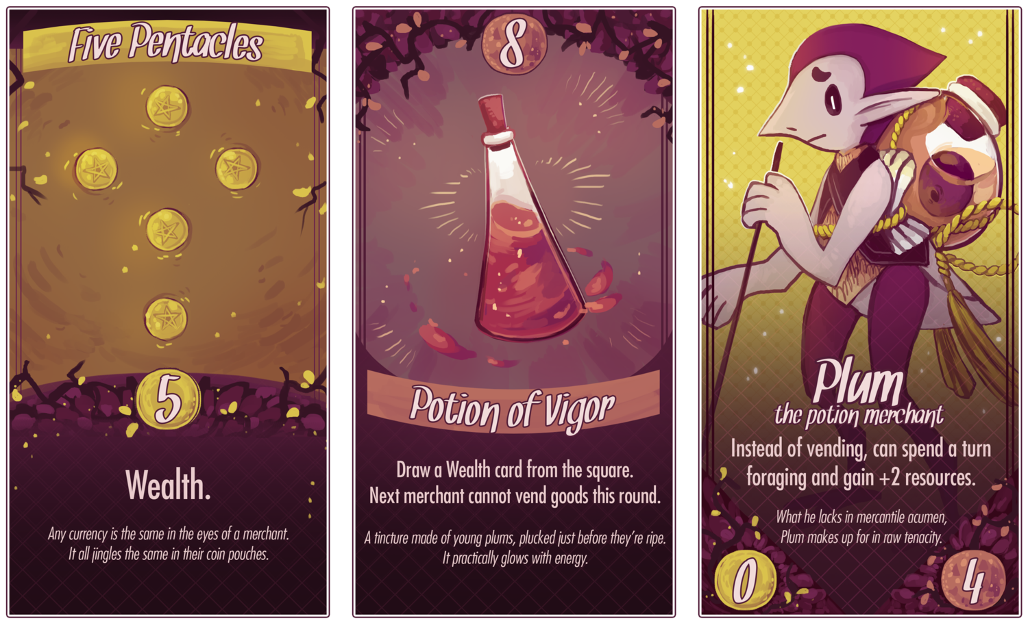
Game Designer: resource collection, shopkeeping mechanics, turn-based collectible card game, pitching.
Visual Designer: art direction, visual identity, character designs.
UI/UX: screen auditing, wireframes, mockups, usability testing.
Process.
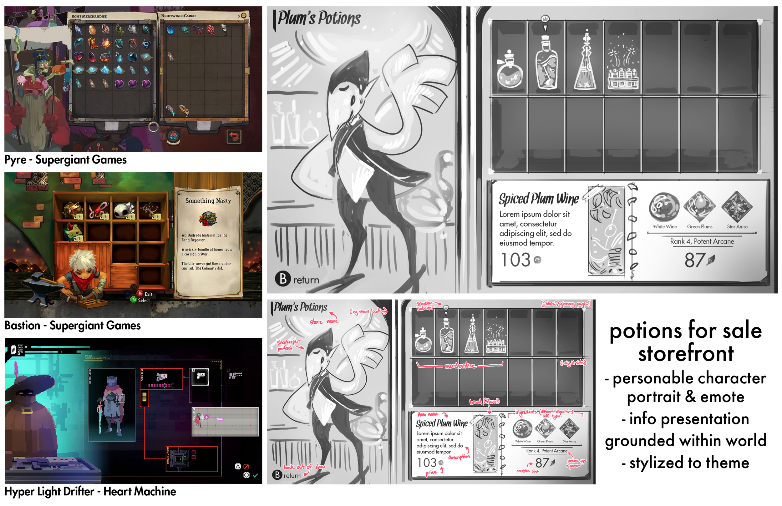
A crucial step in my design process was performing an audit of games with UI/UX that resonated with my own game’s core values.
Potions for Sale is a narrative game that plunges the player into a rich environment, alive with interpersonal connections to other characters with dreams and aspirations. Because of this, I sought out other experiences that similarly emphasized these themes and analyzed what aspects of their user interface helped to elicit such a meaning. It is my personal philosophy that game UI/UX is not simply about graphic design and usability, but is also where game design and art marry to convey meaning. It moves in tandem with mechanics and narrative, ultimately cultivating raw emotion and imparting players with a holistic game experience.
This audit led me to the conclusion that a personal, thematic touch is a powerful tool to keep in consideration for this game. Because my narrative is so character-driven, it’s important to include character portraits in this particular end-product of a Storefront UI, to allow the player to connect with them on a deeper level. The items for sale are also framed within the UI in a way that gives them real physicality. By representing them as actual potions sitting upon a self and presenting their mechanical information through physical tags, they are grounded within the setting. This hammers home the thematic beats I want the user to experience, as they are now encouraged to deeply participate within the game’s world.
Iteration.
While this was a solo project, it was accompanied by a weekly critique, in which I presented my work to a board of sixteen game developers and justified the nuances of my design choices. This included individuals from a wide array of backgrounds, so it was important that I keep in mind a more code or gameplay oriented perspective, along with a visual one, as I explained my decisions and how they worked in service of the overall experience. I would then absorb the feedback I was given and use it to further iterate and refine my designs.
LESSONS LEARNED.
What went well.
Auditing comparable screens in previous games and analyzing exactly what affordances and design choices about them worked was an excellent way to go about designing my own screens. After all, research is always important, and this was a fantastic way to go about leveraging my knowledge of effective titles to make my own work effective. It’s the same as utilizing one’s previous knowledge of game mechanics to devise series of prototypes to test out.
Areas of improvement.
It would be prudent to have done some user stories or even rough journey mapping of the overall game loop and interactions prior to creating full takes on some of these screens. Given, this project was for more of a hypothetical setting, but I can see how the process used would be flawed in a ‘true’ game development setting and have endeavored to start from a more logical starting place in future projects.
Closing thoughts.
This project was a wonderful foray into where Visual Design meets Game Design, and UI/UX’S ability to further sell a down-to-earth vibe in a shopkeeping mechanic—or really any feeling in any gameplay with the right affordances. It was a strong showcase of how my skills can intersect: this would be a weaker UI/UX experience without my Game Design experience, and the game experience wouldn’t be nearly as charming or effective to the player without my UI/UX experience. It’s about holistic considerations and impactful details!


